
Brand

Primary logo
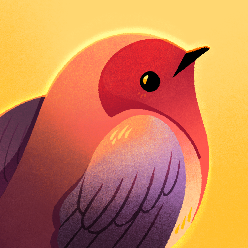
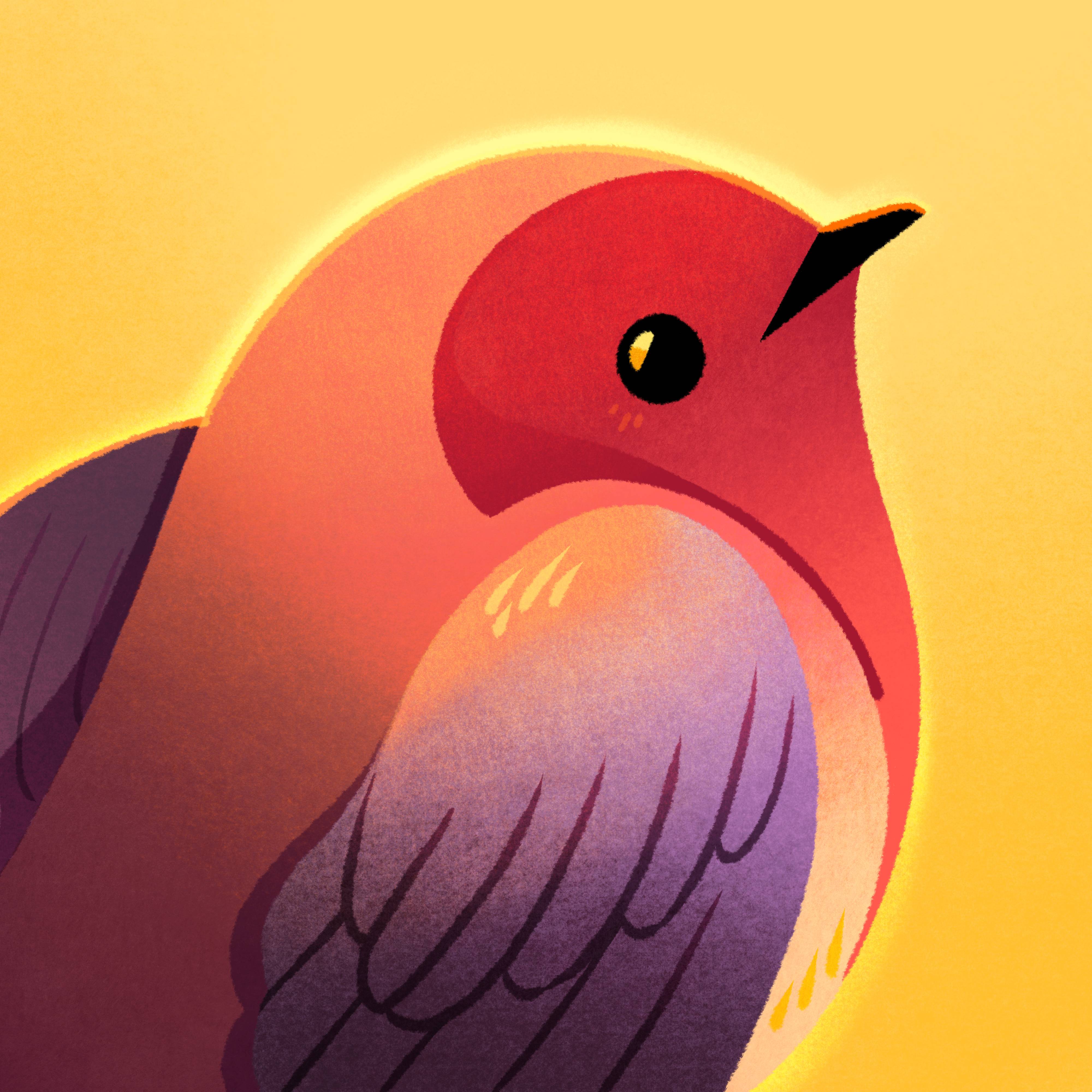
The bird in the circle.

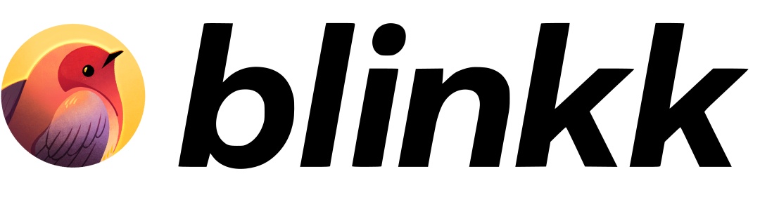
Logo lockup
Bird + wordmark, side by side.


How to use these
Clear space
Leave padding around the logo equal to at least a quarter of its width. Don’t crowd it.
Don’t mess with it
No recoloring, no drop shadows, no stretching, no putting it inside other shapes. Just use it as-is.
Watch the small sizes
The feather details disappear below about 24px. At that size, stick with the circle mark, not the lockup.
Pick the right format
Use the SVG or transparent PNG unless you’re stuck somewhere that doesn’t support transparency. Then grab the JPG.
Need the square version? Some platforms want a non-transparent square with no rounding. Square PNG (1024px) or square JPG (4000px).
Looking for something not listed here? Drop us a line at hello@blinkk.com.